When you think about your favorite brands, what’s the first thing that comes to mind? Often, it’s their colors. From the bold red of Coca-Cola to the calming blue of Facebook, colors create a sense of connection that words alone cannot achieve. This is the essence of color psychology in branding the study of how colors influence perception, emotions, and decision-making. In today’s competitive landscape, understanding this psychology is a powerful tool for businesses to stand out and build loyalty.
What Is Color Psychology?
At its core, color psychology is the study of how colors evoke specific emotions and shape human behavior. In branding, this translates to how consumers perceive your identity and offerings. For example, warm colors like red and orange tend to create a sense of urgency, often used in sales campaigns, while cooler tones such as blue or turquoise establish trust and calmness.
The psychology of color is deeply rooted in culture, personal experiences, and even biology. This is why choosing the right color for your logo design, website, or marketing campaign is not just an aesthetic decision it’s a strategic one.
How Color Psychology Impacts Your Brand
The importance of color in branding cannot be overstated. Studies show that up to 90% of first impressions are based on color alone. The colors you choose directly influence whether a customer sees your brand as energetic, trustworthy, luxurious, or approachable.
Think of color as your silent brand ambassador. It works behind the scenes to draw attention, differentiate you from competitors, and reinforce your messaging. Whether you’re crafting a color branding guide 2025 or optimizing website color psychology, every color choice should align with your company’s values and goals.
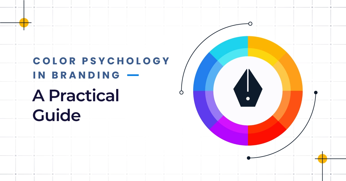
The Meaning of Colors: A Breakdown for Business
Understanding the meaning behind each color helps in choosing the right color for your brand. Here’s a quick color chart to guide you:

Red
The color red is associated with energy, excitement, and passion. It can create a sense of urgency, making it one of the best colors for branding in retail and food industries.
Orange
Orange symbolizes creativity, warmth, and enthusiasm. It works well for brands that want to be approachable yet bold.
Yellow
Yellow radiates optimism and cheerfulness. It’s often used to draw attention and spark joy, though it must be balanced with a neutral background color to avoid overwhelming the viewer.
Green
Green represents growth, health, and sustainability. It’s a perfect color for eco-friendly businesses or companies that want to highlight balance and harmony.
Turquoise
Turquoise blends the calming effect of blue with the refreshing energy of green. It’s ideal for modern tech companies and wellness brands.
Blue
Blue conveys trust, professionalism, and reliability. It’s one of the most popular favorites colors for logo color psychology because of its universal appeal.
Purple
Purple signifies luxury, creativity, and wisdom. It works well for brands aiming to stand as leaders in innovation.
Magenta
Magenta is bold and unconventional. It’s excellent for brands that want to challenge norms and make their brand stand apart.
Brown
Brown evokes stability, honesty, and simplicity. It appeals to brands in industries like coffee, farming, or craftsmanship.
Black
Black represents elegance, power, and authority. Paired with white in black and white branding, it delivers timeless sophistication.
Grey
Grey offers neutrality and balance. It’s often used as an accent color to support stronger shades.
White
White communicates purity, simplicity, and minimalism. It helps create a sense of clarity and space when used as a background color.
5 Tips for Picking Your Brand Colors
Choose a Color That’s Authentic to Your Brand
The colors you choose should reflect your mission, values, and personality. Authenticity ensures consistency and trust across all channels.
Choose a Color That Embodies Your Brand Personality
Does your brand lean playful or professional? Choosing colors that embody your personality will shape how customers perceive you.
Choose a Color That Appeals to Your Audience
Remember, your brand is for your audience, not just you. Use color theory and research into favorites colors to understand what resonates.
Choose a Color That Differentiates Your Brand
Standing out in a crowded market means selecting shades that aren’t overused in your industry. This differentiation helps your brand stand apart.
Consistently Execute Your Brand Colors
Consistency is key. From social media to your website’s background color, ensure the same palette is applied everywhere, creating familiarity and trust.
Key Takeaways & How Q-Tech Inc. Supports Strategic Color Branding
Colors are more than decoration; they’re strategic assets that define your brand’s personality, values, and customer relationships. By understanding the importance of color in branding, you can leverage color psychology in branding to connect with your audience and influence decisions.
At Q-Tech, we help businesses navigate the complexities of branding, from Graphic Design to Website Design. Whether you need guidance on how to choose brand colors, want to explore website color psychology, or require a complete color branding guide 2025, our team ensures that every accent color, palette, and logo design is strategically executed to help your business shine.
By combining the science of color theory with the art of branding, Q-Tech empowers companies to make a lasting impact. Because in the end, the colors you choose aren’t just visual they’re emotional connections that drive growth.