Effective design is the backbone of strong digital marketing. Whether you’re building a website, preparing marketing materials, or posting social content, even small graphic design mistakes can cost you conversions, credibility, and brand recognition. Many businesses underestimate how elements like color palettes, typography, image size, and visual hierarchy influence how customers perceive their brand message. To help you avoid costly errors, we’ve created this guide that breaks down common graphic design mistakes and how to fix them so your digital presence feels polished, strategic, and consistent.
Graphic Design Mistakes That Are Crushing Your SEO & Conversion Rates
Good design isn’t just about aesthetics—it’s about clear communication, user experience, and maintaining branding consistency across every touchpoint. Issues like website design mistakes, mobile design mistakes, low-contrast text, and unoptimized images don’t just frustrate users; they also impact search rankings and conversion rates.
Below, you’ll find the most common issues businesses face, complete with solutions that elevate your brand identity and help customers instantly recognize your brand across platforms.
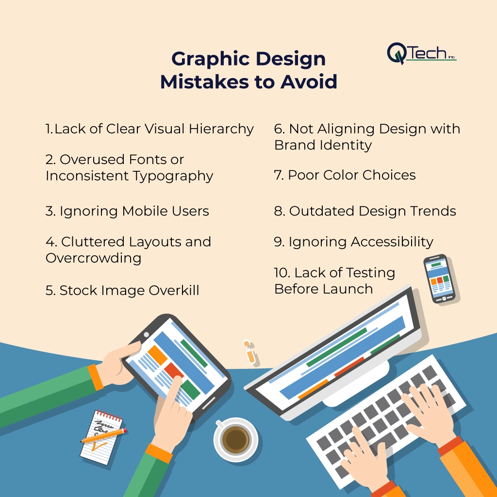
- Lack of Clear Visual Hierarchy
- Overused Fonts or Inconsistent Typography
- Ignoring Mobile Users
- Cluttered Layouts and Overcrowding
- Stock Image Overkill
- Not Aligning Design with Brand Identity
- Poor Color Choices
- Outdated Design Trends
- Ignoring Accessibility
- Lack of Testing Before Launch
1. Lack of Clear Visual Hierarchy
Visual hierarchy helps users understand what to look at first. Without it, your page feels overwhelming and confusing. Many brands fail to structure their visual elements correctly, leaving users unsure of where to click or what to read.
How to Fix It
Use size, spacing, and contrast to guide the viewer’s eye. Consider reviewing graphic design composition examples to see how professionals balance elements effectively. Headlines should be bold and clear, CTAs should stand out, and supporting text should be readable. This is a foundational rule of successful branding and influences how users perceive your visual identity.
2. Overused Fonts or Inconsistent Typography
Using too many fonts—or fonts that don’t pair well—creates confusion and weakens your brand consistency.
How to Fix It
Limit your typography to two or three font families and ensure they align with your brand guidelines, tone of voice, and overall brand strategy. Think of timeless brands like Coca-Cola, whose typography instantly communicates identity. Cohesive typography helps customers recognize your brand anywhere they see it.
3. Ignoring Mobile Users
A huge portion of users browse on mobile devices. Designs that look good on desktop often break on mobile, leading to major mobile design mistakes.
How to Fix It
Prioritize responsive layouts and test your designs on various screen sizes. Ensure buttons are clickable, text is readable, and images resize cleanly. If your brand operates a mobile app, apply the same design rules for consistency.
4. Cluttered Layouts and Overcrowding
Trying to fit everything into one space causes visual overload. This not only reduces readability but also weakens brand messages.
How to Fix It
Use white space strategically to let your content breathe. Simplicity allows your branding elements to stand out and creates a more consistent brand experience. Each section of a webpage or graphic should have one clear purpose, especially in web design and social content.
5. Stock Image Overkill
Stock photos are useful, but relying on them too heavily leads to repetitive imagery and generic brand presence.
How to Fix It
Use a mix of custom photos, branded graphics, and high-quality stock images. When using stock photos, adjust colors or overlays to match your color scheme and color palettes.
Not Aligning Design with Brand Identity
Many brands struggle with maintaining branding consistency across platforms, resulting in social media graphic mistakes and disorganized marketing materials.
How to Fix It
Create a clear set of brand guidelines covering logo usage, typography, colors, spacing, patterns, and tone. These guidelines ensure every element—from email headers to printed brochures—supports a unified vision. By ensuring branding consistency, you build trust and improve retention across your audience.
7. Poor Color Choices
Color scheme errors are extremely common. Poor contrast, clashing tones, or mismatched color choices harm readability and reduce professional appeal.
How to Fix It
Select a defined color palette and use it consistently. Avoid low-contrast text, which strains the eyes and decreases accessibility. Great brands rely on colors that strengthen their messaging and emotional tone. Your palette should also translate well across print, digital platforms, and mobile layouts.
8. Outdated Design Trends
Design evolves rapidly. What looked modern five years ago may feel outdated today.
How to Fix It
Evaluate your visuals regularly. Swap outdated filters, gradients, clip-art graphics, or textures with cleaner, modern aesthetics. Look for patterns in contemporary branding that emphasize clarity, authenticity, and function. Your brand should combine timeless structure with modern execution.
9. Ignoring Accessibility
A beautiful design is ineffective if people can’t interact with it.
How to Fix It
Follow WCAG guidelines. Ensure readable text sizes, strong color contrast, alt text for images, clear labels, and keyboard-friendly navigation. This improves both user experience and SEO performance while making your brand more inclusive.
10. Lack of Testing Before Launch
One of the most overlooked steps in design is proper testing. Without testing, issues like image size, unoptimized images, misaligned formatting, broken layouts, and readability problems go unnoticed.
How to Fix It
Test across browsers, devices, and screen sizes. Review how your design appears in emails, social platforms, PDFs, and printed formats. Make adjustments before launching final marketing materials to ensure everything looks polished.
Conclusion & How Q-Tech Inc. Helps You Avoid Mistakes
Great design isn’t just an aesthetic choice—it’s a business advantage. By avoiding these common graphic design mistakes, you create a brand that communicates clearly, builds trust, and converts more effectively. From fixing color scheme issues to enhancing mobile responsiveness and strengthening your visual identity, every improvement helps your audience recognize your brand and engage confidently.
At Q-Tech Inc., we help businesses transform their digital presence through strategic design rooted in clarity, branding, and user experience. Whether you need stronger website visuals, polished social graphics, better brand guidelines, or a complete visual overhaul, our team ensures your brand communicates with purpose, consistency, and professionalism. With expert designers, modern tools, and a deep understanding of digital marketing, we empower your business to stand out and create a compelling, consistent brand experience everywhere your audience meets you.
FAQ
How do graphic design mistakes affect SEO rankings?
Answer – Graphic design mistakes negatively affect SEO by causing slow page load times (unoptimized images), leading to high bounce rates (poor visual hierarchy), and failing the mobile-friendliness and accessibility checks, which are all critical Google ranking factors.
How many colors should be in a design?
Answer – For a cohesive and professional look, limit your color palette to 3 main colors: a dominant color (~60%), a secondary color (~30%), and an accent color (~10%). The accent color is used for buttons, links, or key elements you want to highlight. Using too many colors is a common mistake that creates visual chaos and dilutes your brand identity.
Why is white space important in design?
Answer – White space (or negative space) is not ‘wasted’ space. It is a critical design element that improves readability, creates a feeling of sophistication, and helps group related items together while separating unrelated ones. Cluttered designs without enough white space are overwhelming and difficult for the viewer to process, leading to a poor user experience.
Why is using low-resolution or unoptimized images a design mistake?
Answer – It is a mistake because low-resolution images look unprofessional, but more importantly, unoptimized images (large file sizes) drastically slow down page speed, which is a core user experience signal and a direct SEO ranking penalty.
What is the rule for font usage in professional graphic design?
Answer – The general rule for professional digital design is to use a maximum of two to three font styles. Using too many fonts creates visual clutter, damages readability, and compromises brand consistency.