
Most of your customers are already browsing, researching, and buying from their phones—often in the few spare minutes they have between meetings, errands, or family time. If your site isn’t optimized for mobile, every slow load, tiny button, or awkward layout becomes a reason to leave. That’s why understanding the key benefits of a mobile-friendly website is no longer a “nice to have”; it’s a core part of modern digital strategy and website design that directly impacts revenue, reputation, and growth.
A mobile-friendly site gives your business a powerful advantage: it makes every interaction feel smooth, intuitive, and trustworthy, no matter the screen size. In this article, we’ll break down the importance of mobile optimization, how it affects SEO.
What Does “Mobile-Friendly” Mean?
A truly mobile-friendly website is more than a shrunken desktop page. It’s a site optimized for mobile from the ground up so that content, images, and navigation automatically adapt to any screen size, smartphones, tablets, and everything in between. On mobile-friendly websites, users can read text without zooming, tap buttons without misclicks, and complete tasks without friction.
From an experiential standpoint, mobile websites are built to enhance the user experience at every step: clear layouts, a logical information hierarchy, and fast-loading content. From a technical standpoint, they use modern code and responsive web techniques that help search engines understand your content and crawl and index your pages efficiently. The result is a seamless blend of user experience design and performance that supports both humans and algorithms.
Responsive Design vs Separate Mobile Site
Historically, some companies created a separate mobile version of their site (often with an “m.” subdomain). Today, that approach adds complexity, duplication, and SEO headaches. Every time you update content or fix an error, you have to do it twice, which is an easy way to let one side fall behind.
That’s why responsive web design has become the standard. With responsive design, your website design uses fluid grids, flexible images, and CSS media queries so each page automatically adjusts to different devices. This responsive design approach keeps your content on a single URL, simplifies maintenance, and makes it easier for search engines to crawl and index your site correctly. It’s also far more scalable as you add new pages or digital campaigns in the future.
Key Mobile Usability Elements (Touch, Navigation, Readability)
Even the best layout can fail if it’s hard to use on a phone. Great mobile usability focuses on three pillars: touch, navigation, and readability. Buttons and links must be large enough and spaced properly so thumbs can tap them comfortably. Menus should be simple, predictable, and easy to reach with one hand. Text needs to be large and high-contrast so it’s readable indoors, outdoors, and on the go.
Together, these elements shape the user experience UX. When you get them right, you create an experience UX that feels intuitive and user-friendly, reinforcing your brand as modern and customer-focused.
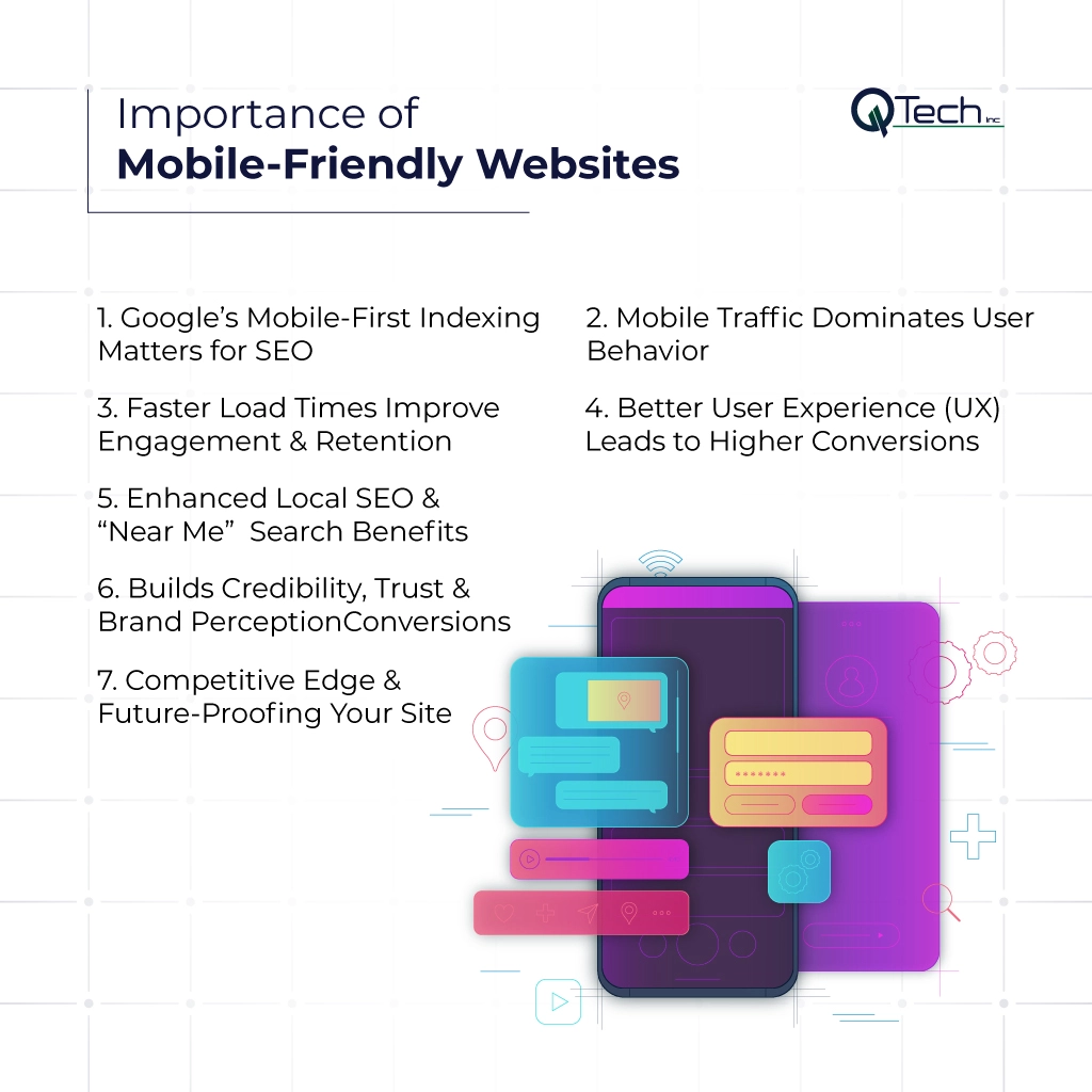
The Importance of Mobile-Friendly Websites
- Google’s Mobile-First Indexing Matters for SEO
- Mobile Traffic Dominates User Behavior
- Faster Load Times Improve Engagement & Retention
- Better User Experience (UX) Leads to Higher Conversions
- Enhanced Local SEO & “Near Me” Search Benefits
- Builds Credibility, Trust & Brand Perception
- Competitive Edge & Future-Proofing Your Site
Reason 1: Google’s Mobile-First Indexing Matters for SEO
Google now primarily evaluates the mobile version of your site when deciding how to rank your pages. This shift, often referred to as Google’s mobile-first indexing, means that if your mobile site is broken, incomplete, or slow, your visibility will suffer—even if your desktop site looks great.
From an SEO perspective, mobile optimization is non-negotiable. A site that’s easy to crawl and index, uses structured data, and displays correctly on mobile devices supports stronger rankings and better overall seo performance across your key keywords and service pages.
Reason 2: Mobile Traffic Dominates User Behavior
Across industries, mobile users often represent the majority of website visits. People research service providers, compare prices, and read reviews from their phones long before they fill out a form or pick up the phone to call you. Ignoring mobile means ignoring how your real audience actually behaves online.
The mobile website benefits are clear: when mobile-optimized websites load quickly, look professional, and function smoothly, visitors stay longer, explore deeper, and are far more likely to convert. The importance of mobile goes beyond convenience; it’s about aligning your digital experience with the way people naturally live, work, and buy today.
Reason 3: Faster Load Times Improve Engagement & Retention
On mobile, every second counts. Heavy images, bloated code, and unnecessary scripts can slow your pages to a crawl, especially on cellular connections. Users don’t wait; they abandon slow sites and move on to competitors who respect their time.
A mobile-focused performance strategy streamlines code, compresses media, and prioritizes critical content so pages load quickly. When your site is truly optimized for mobile, you reduce bounce rates, increase time on site, and naturally improve user experience. Faster pages also send strong positive signals to search engines, reinforcing both your rankings and your reputation.
Reason 4: Better User Experience (UX) Leads to Higher Conversions
Great user experience UX isn’t just about aesthetics; it’s about making it effortless for visitors to accomplish their goals. Clear calls to action, simple forms, and intuitive menus help users move from curiosity to action, submitting a contact form, booking a consultation, or making a purchase.
To get there, you need real user testing, ongoing usability testing, and thoughtful user research. By watching how people interact with your site on their phones, you uncover friction points that analytics alone might miss.
Reason 5: Enhanced Local SEO & “Near Me” Search Benefits
When people search “IT support near me” or “digital marketing agency in Miami” on their phones, they’re often ready to act. Mobile websites that are fast, clear, and aligned with local search best practices have a far better chance of appearing in those results and winning that business.
Local SEO success depends on accurate listings, consistent NAP (name, address, phone), and clean structured data that helps search engines understand your business location and services. Pair that with a mobile experience that loads quickly and answers key questions, and you’ll unlock some of the most valuable mobile website benefits available to local brands.
Reason 6: Builds Credibility, Trust & Brand Perception
Visitors form an opinion about your brand within seconds. If your mobile site looks outdated, is hard to read, or breaks on certain devices, they may question your professionalism in other areas of your business as well. On the other hand, polished mobile-friendly websites communicate that you are modern, reliable, and attentive to detail.
This perception directly affects referrals, reviews, and repeat business. Investing in high-quality mobile-friendly website optimization is really an investment in trust. It shows customers you value their time and are serious about delivering a seamless digital experience.
Reason 7: Competitive Edge & Future-Proofing Your Site
The importance of mobile optimization will only grow as new devices, interfaces, and user expectations emerge. Businesses that treat mobile as a strategic priority now will be better positioned as competition increases and technology evolves.
By embracing responsive web principles and continuous improvement, you’re not just catching up, you’re staying ahead. Prioritizing the importance of mobile today means your brand remains relevant tomorrow, even as new channels and devices enter the mix.
How to Optimize Your Website for Mobile
Mobile success doesn’t happen by accident. It requires a structured plan, guided by data and aligned with your business goals. Below are some of the core best practices we use when building or improving mobile-optimized websites for our clients.
Use Responsive Design & Media Queries
Start by ensuring your site is built with a robust responsive web design. This means using fluid grids, flexible imagery, and CSS media queries so each layout adjusts gracefully across devices. Rather than maintaining separate desktop and mobile version sites, responsive development keeps everything centralized, consistent, and easier to manage.
When you’re ready to redesign or upgrade, focus on mobile mobile-friendly design that supports your brand, your content, and your conversion goals at the same time.
Optimize Images and Media for Speed
Visuals are essential, but on mobile, they must be optimized carefully. Large, uncompressed images and auto-play videos are common culprits behind sluggish pages. By compressing images, using next-gen formats, and lazy-loading non-critical media, you can significantly improve mobile performance.
This fine-tuning not only enhances user experience UX but also supports your seo performance by reducing bounce rates and improving engagement metrics that search engines pay attention to.
Improve Touch Targets & Navigation
Navigation should feel natural on a small screen. Ensure buttons, links, and menus are large enough to tap easily, with ample spacing to prevent accidental clicks. Consider thumb reach when placing critical actions like “Call,” “Book Now,” or “Get a Quote.”
A thoughtful navigation structure makes your site more user-friendly and dramatically improves user experience on smaller devices. When aligned with your broader user experience design, it gives mobile users a clear path from first impression to final conversion.
Test Performance & Core Web Vitals
Finally, don’t guess—test. Regular user testing, analytics reviews, and usability testing reveal how real visitors interact with your site. Monitoring Core Web Vitals (like loading, interactivity, and visual stability) helps ensure your pages meet modern performance standards and remain optimized for mobile over time.
Combine this ongoing testing with periodic SEO and UX audits, and you’ll be equipped to adapt quickly as devices, networks, and user expectations change.
Conclusion: Elevate Your Mobile Performance with Q-Tech Inc’s Proven Solutions
The shift to mobile isn’t a trend; it’s a fundamental change in how people live and do business. Understanding the importance of mobile and acting on it now can transform your website from a static brochure into a high-performing digital engine for growth. When you invest in mobile-friendly website optimization, you’re investing in visibility, trust, and long-term customer relationships.
Q-Tech Inc helps businesses like yours harness the full power of mobile, combining strategy, design, and development to build mobile-friendly websites that rank well, convert consistently, and scale as you grow. If you’re ready to explore the full mobile website benefits available to your brand, our team is here to guide you every step of the way.
FAQ
Q: What does ‘mobile-friendly website’ actually mean?
A: A mobile-friendly website is specifically designed to provide an optimal viewing and interaction experience on mobile devices. This means: text is readable without zooming, tap targets (buttons/links) are appropriately sized, the site loads quickly on mobile connections, and navigation is simplified for touchscreens. It’s not just about fitting on a small screen—it’s about being easy to use.
Q: What is Google’s mobile-first indexing?
A: Mobile-first indexing means Google primarily uses the mobile version of your website’s content for indexing and ranking. Since most users now access Google via mobile devices, Google crawls and evaluates your mobile site to determine where your pages should rank in search results. If your mobile site has less content or poorer quality than your desktop site, your rankings will suffer.
Q: How can I test if my website is mobile-friendly?
A: The easiest way is to use Google’s free Mobile-Friendly Test tool. Simply enter your website URL, and Google will analyze it and provide a report. Additionally, you can view your site on various mobile devices, use browser developer tools to simulate mobile views, and check Google Search Console for Mobile Usability reports that highlight specific issues.
Q: What’s the difference between responsive design and a mobile-friendly website?
A: All responsive websites are mobile-friendly, but not all mobile-friendly sites use responsive design. Responsive design is a specific approach where the same HTML code is served to all devices, but CSS is used to change how the page renders on different screen sizes. ‘Mobile-friendly’ is a broader term that can also include separate mobile sites (m.dot sites), though responsive design is now considered the best practice by Google.
Q: Can a non-mobile-friendly website still rank well in Google?
A: It’s extremely difficult and becoming nearly impossible. Since Google moved to mobile-first indexing, sites that aren’t mobile-friendly are significantly penalized in search rankings, especially for mobile searches. Even for desktop searches, Google considers mobile-friendliness as a ranking factor. A non-mobile-friendly site is at a severe competitive disadvantage and will likely see declining traffic over time.
